

By Dina Goembel, Owner & Lead Designer
Almost every client who sits down with us starts in the same place: “We want white cabinets.”
Then I hand them the door samples — and there are twelve of them. All white. All completely different. That moment is usually where the real design conversation starts, because “white” isn’t one color. It’s a whole range, and the one you choose changes how the entire kitchen feels.
First, how many whites are we actually talking about?
If you’re looking at stock cabinets, you’ll usually get one or two whites. Maybe a bright white and an off-white. That’s the whole menu.
With custom and semi-custom lines, you’re choosing from ten or twelve — bright whites, soft off-whites, creams, linens, and warm beiges. In our own projects we’ve used everything from a crisp Divinity to a softer Alabaster to a clean Bright White, and they read completely differently once they’re on the wall. More choice is a good thing. It’s also exactly why people freeze at this stage.
Undertones are the whole game
Every white leans somewhere. Some lean grey. Some lean blue. Some lean yellow or cream. A few lean slightly green. You almost never notice it looking at one sample by itself — but set two side by side and it’s obvious. One suddenly looks warm, and the other looks stark.
Here’s the short version of what those undertones actually do in a kitchen:
- Cool undertones (grey, blue) read crisp, clean, and a little more modern. They’re beautiful with grey-veined marble, polished nickel or chrome, and cooler paint colors. Push it too far and the room can feel cold.
- Warm undertones (cream, beige, linen) read softer and more inviting. They’re lovely with warm woods, brass and honey bronze, and warm-toned stone. Push it too far — especially next to cool finishes — and it starts to look yellow.
Neither one is better. What matters is which direction the rest of your kitchen is already pulling.
Your white doesn’t live by itself
This is the part people miss. You’re not choosing a white — you’re choosing a white for that room, next to everything else in it. Before we land on a cabinet color, we look at:
- The countertop. A marble or quartzite with grey veining pulls the grey out of a cool white. A warm, creamy stone will fight a blue-toned one.
- The floors. Red oak runs warm and orange; white oak is more neutral. The wrong undertone over warm floors can look dingy.
- The hardware. Brass and honey bronze are warm. Nickel and chrome are cool. Your hardware and your cabinet white should be on speaking terms.
- The island. If you’re doing a colored island — blue, green, a soft grey — that color amplifies whatever undertone your white already has. A blue island beside a blue-leaning white can tip the whole room cold.
- The trim and ceiling. Your existing trim is already a specific white. If the cabinets miss it by a little, it reads like a mistake instead of a choice.
Light will change your mind
The same door sample looks like a different color at 8am and 8pm.
North-facing kitchens get cooler, bluer light all day, which exaggerates grey and blue undertones. South-facing rooms get warm light that softens everything. And under-cabinet LEDs have their own color temperature — a cool strip light can make a warm white suddenly look grey. This is why we never let anyone choose a white from a photo, a screen, or a one-inch paper chip.
How we actually choose it
The process is simple, and it works:
- Get real door samples — the actual finish on the actual door style, not a paper chip.
- Take them home and set them in the room where the cabinets are going.
- Put them next to the real materials — your counter sample, your floor, your hardware, your backsplash tile.
- Look at all three times of day — morning, mid-afternoon, and at night with the lights on.
- Choose in context, not in isolation. We usually settle the cabinet white after the counter and floor are chosen, because those are what it has to live with.
After thirty years of this, I can usually tell within a few minutes which direction a kitchen wants to go. I still send the samples home. The room always has the final say.
See it in our kitchens
A few examples of the same idea playing out differently:
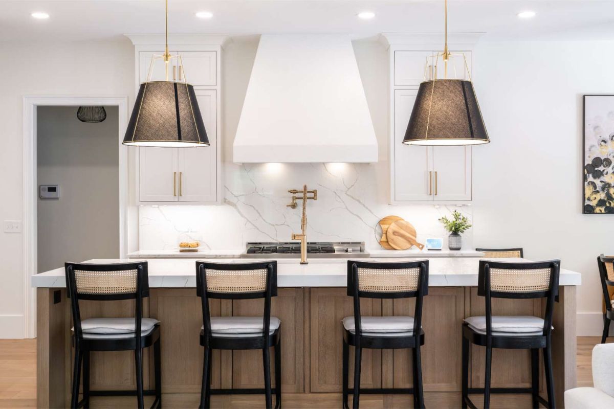
- Crisp white, warmed up by wood. In our Modern Oasis kitchen, a clean painted perimeter is balanced by a white oak island. The wood keeps all that bright white from ever feeling cold.
- A softer white with warm browns. In this alabaster kitchen, the white leans warm on purpose so it sits comfortably beside a stained-ash island and a custom wood hood.
- White as the quiet backdrop. In our white oak and green island kitchen, the neutrals hold everything steady so one bold color can do the talking.
- White with a soft grey partner. In this alabaster and haze kitchen, a warm white perimeter meets a soft grey island — quiet contrast that still reads timeless.
The takeaway
There’s no single “best” white for kitchen cabinets, and anyone who tells you otherwise is selling you their favorite instead of designing for your house. The right white is the one that works with your counters, your floors, your hardware, and your light — and you’ll know it when you finally see all of those together.
If you’re at that stage and staring at a pile of samples, that’s exactly the part we’re good at. Take a look at our kitchen remodeling and custom cabinetry work, or book a design consultation and we’ll go through it together.